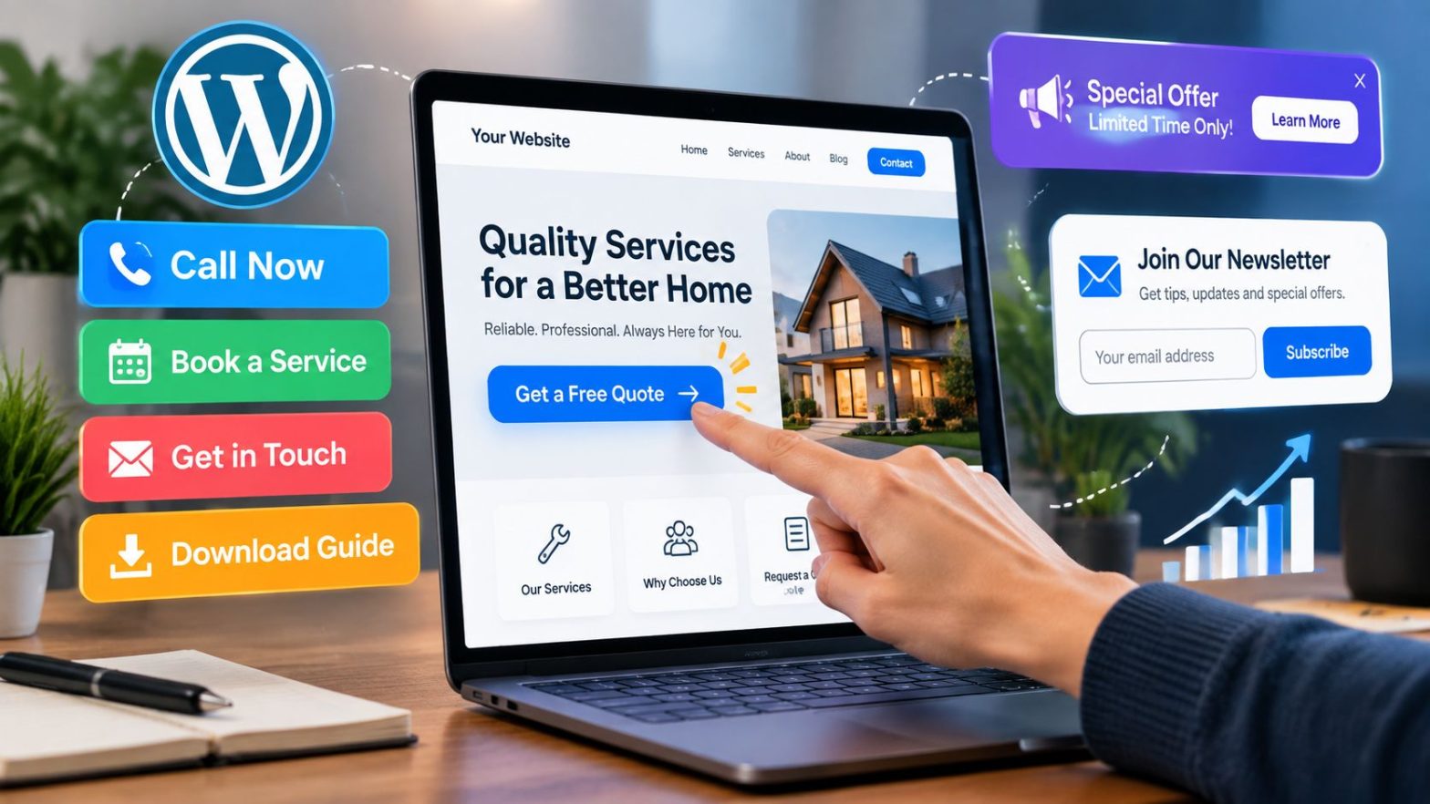
A WordPress website can attract visitors from many different sources, but traffic alone does not guarantee meaningful results. A successful website needs to help visitors understand what is being offered, find relevant information, and take the next step when they are ready.
That next step might be contacting a business, purchasing a product, downloading a resource, booking an appointment, or subscribing to updates.
Improving conversion opportunities is not always about making dramatic design changes. Often, small improvements to navigation, messaging, page structure, and user interactions can make the website easier to use and more effective.
Understand What Visitors Are Trying to Achieve
Before changing a website, it helps to understand why people visit it in the first place.
Different visitors arrive with different goals. Someone landing on a service page may want pricing information or a way to contact the company. Someone reading a blog article may be looking for education before making a decision.
A website should support these different stages instead of treating every visitor the same.
For example, asking a first-time visitor to immediately make a purchase may not always be appropriate. A better option could be offering additional information, a helpful guide, or an opportunity to learn more.
Understanding visitor intent helps businesses create clearer pathways that naturally lead people toward valuable actions.
Improve Website Navigation and Page Structure
A confusing website can prevent visitors from reaching important pages.
Navigation should help users quickly understand where they are and where they can go next. Main services, products, contact options, and important resources should be easy to locate.
Page structure also matters.
A well-organized page typically introduces the main topic, explains the value, addresses common questions, and provides a clear next step.
Long blocks of text without headings, unclear menus, or too many competing options can make visitors leave before they discover what the website offers.
Simple structure creates a smoother experience.
Create Clear Calls to Action
Calls to action are one of the most important parts of a conversion-focused website.
A CTA tells visitors what they can do next, but it should do more than simply exist as a button.
Effective CTAs are connected to the visitor’s needs.
A service business might encourage visitors to request an estimate. A software company may invite users to start a trial. A content website might encourage readers to subscribe for updates.
The wording should be specific enough that users understand what will happen after clicking.
For WordPress websites that require different CTA placements and styles, solutions such as WP CTA Pro can help website owners manage call-to-action elements while keeping them connected with the overall website experience.
The goal is not to add buttons everywhere. The goal is to make important actions easier to discover.
Make Important Pages More Persuasive
Every website has pages that play a major role in helping visitors make decisions.
These might include service pages, product pages, landing pages, pricing pages, or contact pages.
These pages should answer the questions visitors are likely to have before taking action.
A visitor may want to know:
- What problem does this solve?
- Why should I consider this option?
- What happens next?
- How do I get started?
Clear answers reduce uncertainty.
Strong pages also avoid unnecessary distractions. If a page is designed to encourage a specific action, unrelated links and competing messages should be limited.
The visitor should have a clear understanding of the next step.
Improve Website Speed and User Experience
A website that feels slow or difficult to use can create frustration before visitors ever reach a conversion point.
Performance improvements can include optimizing images, reducing unnecessary scripts, choosing reliable hosting, and keeping plugins properly maintained.
User experience also includes how easily visitors can interact with the website.
Google’s page experience guidance highlights factors such as loading performance, mobile usability, and visual stability that contribute to how users experience a website.
These improvements are valuable not only for visibility but also for helping visitors complete actions without unnecessary obstacles.
Design for Mobile Visitors
Many users interact with websites through smartphones, so conversion elements need to work well on smaller screens.
A desktop layout may look excellent but still create problems on mobile.
Common issues include:
- Buttons that are difficult to tap
- Forms that are too complicated
- Text that is difficult to read
- Important information that is hidden too far down the page
Mobile visitors should be able to understand the offer and complete the desired action without extra effort.
Testing pages on different devices can reveal problems that are easy to miss when viewing only the desktop version.
Use Forms Carefully
Forms are often the point where interested visitors become identifiable leads.
However, forms can also create unnecessary friction.
A form asking for too much information may discourage visitors from completing it. A form asking for too little may make it harder for a business to understand the inquiry.
The right balance depends on the purpose.
A newsletter signup may only require an email address. A consultation request may reasonably require additional project details.
The form should collect useful information while respecting the visitor’s time.
Build Trust Throughout the Website
Visitors are more likely to take action when they feel confident about the business or website they are interacting with.
Trust can be supported through clear information, helpful content, transparent policies, customer feedback, examples of previous work, and easy-to-find contact details.
Businesses should focus on providing genuine reassurance rather than adding unnecessary promotional statements.
A visitor should feel that the website understands their needs and provides a reliable path forward.
Personalize the Experience Where Appropriate
Different visitors may respond to different messages.
A returning visitor may already understand the business, while a first-time visitor may need more explanation.
Personalization can be used to present more relevant content based on factors such as the page someone visits, previous interactions, or the type of information they are viewing.
This does not require creating a complicated experience.
Even simple improvements, such as showing related resources after an article or presenting a relevant CTA on a service page, can make the website feel more helpful.
Track Visitor Behavior and Make Improvements
Conversion improvement is an ongoing process.
Website owners should review how visitors interact with important pages and identify areas where people may be leaving without taking action.
Useful information can include:
- Which pages receive the most attention
- Which buttons receive engagement
- Where visitors stop progressing
- Which forms are completed
- Which pages generate inquiries
The purpose of reviewing this information is not just collecting data. It is understanding what visitors need and making the website easier to use.
Use the Right Tools Without Overcomplicating the Website
WordPress provides flexibility through themes, plugins, and integrations, but adding too many tools can sometimes make websites harder to manage.
The best approach is selecting tools that solve specific problems.
For businesses looking to improve how CTAs are displayed and managed, WordPress conversion tools can provide additional options for organizing important visitor actions without rebuilding the entire website.
Every tool should support the overall goal of creating a smoother user experience.
Create a Website That Guides Visitors Naturally
Improving conversion opportunities is not about forcing visitors to take action. It is about creating a website that makes useful actions easier when people are ready.
Clear messaging, intuitive navigation, effective CTAs, strong page structure, and a smooth user experience all work together to support better outcomes.
A well-optimized WordPress website should answer questions, reduce uncertainty, and guide visitors toward the next logical step.
Small improvements made consistently can create a website experience that serves both the business and its audience more effectively.